Codeias is used to treat mild-to-moderate types of development pain.
Codeias is used to treat mild-to-moderate types of development pain.
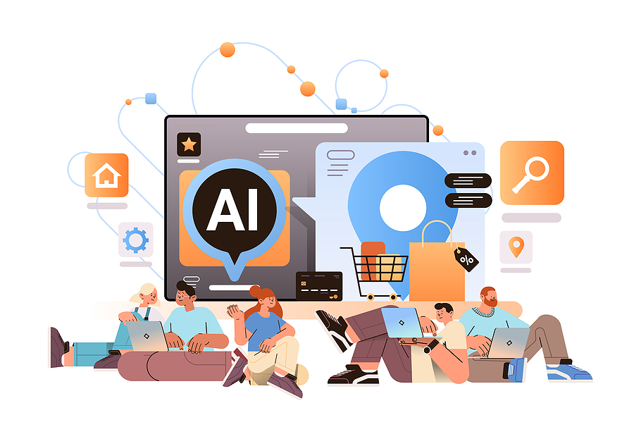
Whilst there are always exceptions in web design, for the most part, both bespoke and white label development of online platforms is built around making the user experience as easy as possible so customers have a quick pipeline to the products and services they want.
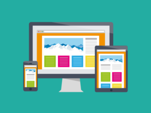
For example, a lot of websites are designed with mobile-first principles in mind because outside of a few business-to-business industries, people are more likely to visit websites on a smartphone than on a desktop or laptop.
There are a lot of websites that break one or more fundamental rules of web design, but whilst their lead is to be avoided, they can provide great lessons in what not to do.
There are a lot of websites that are very close to getting it right but a small error hurts the user experience, and the design of the Tag Team Signs website is a good demonstration of how small issues add up.
In many respects, the website is well-made; it is clean, with huge bold images and text, but the bright red contrasting a busy grey background is difficult to see without a text box or drop shadow, and whilst the images have text boxes when you hover over them, there is no further information given.
It is a few adjustments short of being a good website.
The most difficult balancing act that any website attempts is to marry simplicity to effective, striking branding and imagery. Most ineffective websites are guilty of trying to do too much with the space available, but Craigslist has the opposite problem.
Even in 1996 when the first version of the website went up it looked more like a website three years behind the times and has kept that blank look ever since.
There are two schools of thought on this; one is the argument that the simple look is Craigslist’s trademark style and changing it at this point would upset more users than it would bring in.
On the other hand, given that they sued companies trying to help the website provide a better service, the reasons for refusing to get with the times might not be quite as altruistic.
Most websites do not get a lot of time to make a first impression, and so a website’s home page should have striking imagery, effective branding and copy that makes a user want to stick around and feel like they will find the information they require.
Surprisingly, the website of novelist Suzanne Collins does not do this, and if you did not already
know she was the author of The Hunger Games, it is striking how long it would take to find information about her and her books on the home page amidst a sea of in-jokes and positive review quotes.
All of these elements are fine, but they are not arranged in a way that provides the biggest impact or lets someone not already familiar with her books understand who she is, nor does it provide any kind of functionality or insight interesting to people who already like her work.
At least the book listed is her most recent work.
 Red Flags That A Website May Need Redesigning
 Microsoft Will Provide AI Training To 1m People In The UK
 Different Website Layouts And How To Choose The Right One
 Future Advancements That Could Revolutionise Website Design
 Common Reasons Why Your Website’s Conversion Rate Is Poor